Song Frequency Over Phish Career
02 May 2020 -
Everyone knows which songs Phish has played most often, and many of us can remember different periods where some songs used to be played a lot more than they are now. While it’s easy to go take a quick look at how many times Roggae was played in 2011 or which year had the most Twists, I thought there was probably a way to visualize this to see more of the data all at once.
Equate My Life with Sand
Set 1
My first decision was to show data by 100 shows instead of by year or tour. I think the benefit is comparing song frequency over Phish’s entire career in an easy to see way. In 1994, there were six songs that were played more times than the total number of shows in any year since 2010. So, to even that out, I made intervals of 100 shows instead of years.
I also thought it might be helpful to compare songs by normalizing their x-axis and having it show the number of shows since the debut of each individual song. I thought it would be more interesting to compare the number of Number Lines played in the first 100 shows of 3.0 to the amount of times YEM was played in the first 100 shows after its debut. I was able to use the order_id I had created for my previous project and never used. Essentially, I added this order_id to the song debut table I had made. This made it possible for me to join the tracks table with the shows_w_order table and tack on the order_id of the song’s debut. Then, subtracting the order_id for every track ever played from the order_id of the song’s debut gave me the number of shows since the song debuted as a new column.
I had the data I needed and found a good visualization on Flourish[1] to show a line chart race. I dumped all the data in, did some tweaking and got a cool visualization. And that visualization had way too many lines because I included all songs that had been played at least 100 times.
Setbreak
Nothing interesting to report from setbreak this time. Did a few laps around the concourse and waited in line to pee. The guy next to me in line insisted that they were going to play a Sand but I told them that since it was Sunday, that would not be likely.
Set 2
My next step was to figure out some better ways to display the data so that it wasn’t so busy. My first thought was to drop down to only songs that were played 200+ times. But, if I did that, I’d lose several of the top songs for different intervals. (i.e. Taste has only been played 132 times but was the most played song in the 100 shows leading up to 11/13/97). Thus, I used a hybrid where I dropped all songs that were played less than 200 times unless it was in the top five of any of the intervals I was using.
Another easy way to have much less data was to create different graphs of songs debuted in a specific year. I chose to start with 1995, 1997, and 2009[2], mainly because there were a lot of often played songs debuted in each of those years. For 2009, I switched to 50 show intervals and included songs played 25 times or more.
I put together a graph that aggregates all songs debuted during the last ten Halloween shows because I was curious to visualize how each of the sets impacted future setlists. I think I might drop that from this project and include it in a future project that does the same with album releases, similar to (this) but with the line graph race thing I used here, since this project is already getting a bit data heavy.
After taking a closer look at the data set and realizing that there were 604 tracks listed as segues between at least two songs, I decided it was worth a little extra time to ensure that the Mike’s Song > I am Hydrogen > Weekapaug Groove tracks all got counted under all three songs. This ended impacting about 20 different song totals, so definitely worth the extra time before sharing.
Encore
I’m also thinking about doing the same type of graph but instead of times played, it shows the average length of the song during each interval. This would be a pretty cool way to see the evolution of songs in regards to length.
Teases
[1]I’m sure there are other free data visualization softwares out there and I’ll need to eventually learn more about those tool options. But, for now, I’m mainly trying to get a few posts ready for sharing and I can always go back and update these graphs if I find a better tool. [2]It would be very easy to create more of these for any subset of songs. Requests accepted.
Mystified and Mishapen
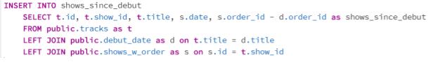
- SQL Code for creating a table with a shows_since_debut column
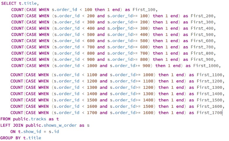
- SQL Code for pulling number of times a song is played in each 100 show interval
And You Step To The Line
You can find all graphs mentioned by using the arrows at the top of the window.
Setlist Notebook
I dumped all the results from the sql queries into a google spreadsheet. There isn’t much in there that you can’t see in the graphs. But, if you want the data to try some of your own visualizations. It’s there for the taking.