Visualizing Supreme Court
24 Sep 2020 -
The last few days of having politicians on both sides making claims of things being unprecedented or having clearly consistent precedent got me curious enough to make a few graphs about the Supreme Court. I needed to look into the history of nominations, timelines, and tenures.
I am a bit biased in that I was hoping to find some compelling reasons for term-limits for justices. Partly because of my frustration with the conservative power imbalance, but also because it just feels so gross, fundamentally, as a human, to politicize the death of people who gave their life to serve the country and to push many of them to work through illness to protect the ideology of their seat.
So I did one of my favorite things, made some graphs.
The first graph is a visualization of the confirmation process with the starting point being the last day of the previous judge’s tenure on the court. Many past judges have announced their retirement in the past and thus the confirmation process starts before their last day. For justices who died while serving, the timeline starts on that day and the bar starts the day that the sitting president sends the nomination to the senate. In the image, I only included judges who took office after 1961, but if you click the link below you can see all justices and filter by either only justices who replaced a judge who died in office or by the party that nominated the justice.
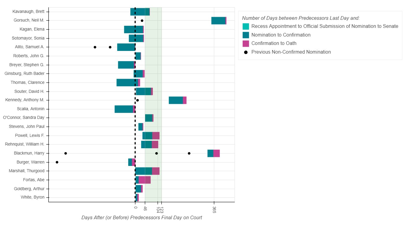 My takeaway: There really aren’t any consistent patterns, which leads me to the conclusion that anyone saying “There is no precedent of X” or “There is a clear historical precedent for Y” has carefully designed X or Y to fit their narrative. Not surprising, but I think it’s helpful to call out because people will be tempted to let these claims entrench them more in their beliefs. Also, the lack of consistent patterns seems to me to be purely due to the politicization of the process. It makes me wonder how much more civil and productive the process would be, and how much public trust each justice would have, if these nominations were for a set period of time instead of being indefinite.
The second graph is a comparison between how much support a justice had in their confirmation vote and how long they ended up serving on the court. I thought it would be interesting if there was any pattern of highly partisan confirmations leading to justices staying on the court longer. This doesn’t seem to be the case with r^2 equal to 0.05, which means that only 5% of the variation in a justice’s tenure can be explained by variation in the percentage of the vote they got. There are a couple justices that barely got through the nomination and served almost 30 years (Thomas and Taney) and three of the six justices who served longer than 30 years had bipartisan support (Douglas, Stevens, and Kennedy).

My takeaway: While the correlation between these measures isn’t strong, I think it’s the variance on both axes that supports term limits. The lack of clarity of how long a judge will be confirmed for leads to higher stakes and more political divide.
The third graph breaks up each presidential term into two halves to show which party held the power of president and senate during each interval since 1961. (I dropped 2001-2003 since the power balance changed a few times in the Senate and there were no vacancies to fill during that time.) The most basic way to think about this is that there have been 8 presidential terms won by Republicans (53%) and 7 won by Democrats (47%) since 1961 when JFK was elected. In that time Republican presidents have filled 14 seats (64%) and Democrats have filled 8 seats (36%). You can see how those patterns are exacerbated more if you look at how it breaks down by Senate control in the graph. In general, there is about one nomination per 2 year term for Republican presidents regardless of who controls the senate or for Democrat presidents who were able to nominate when the senate was held by Democrats. However, for Democrat presidents who served with a Republican senate, a justice hasn’t been confirmed in this situation since before 1961.
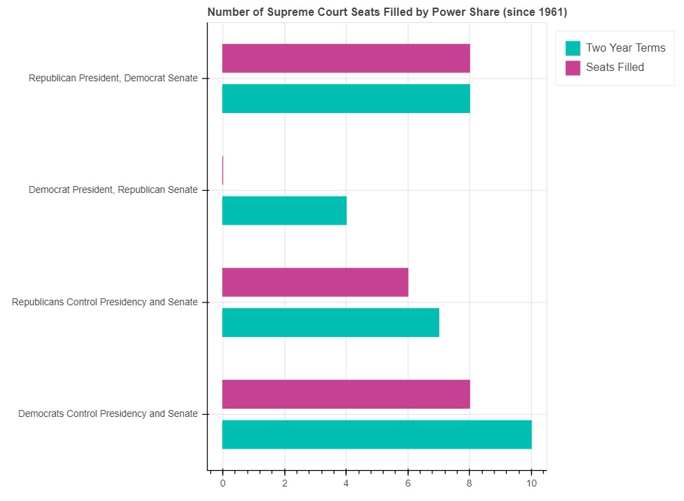
My takeaway: Power has been shared relatively equally across the two parties in the last 60 years but nominations to the Supreme Court haven’t, I think term limits could even this out in a way that creates a sense of fairness in the voting population and interrupts the power struggles in Senate and forces them to do something productive like police reform or pandemic support.
Ultimately, I don’t think anything here will convince anyone of anything they don’t already believe. And, to be honest, I’m much closer to thinking that dismantling our systems is going to be better in the long run, than making incremental reforms like Supreme Court term limits. But, I was curious and spent the time making the graphs so I thought I’d share my thoughts and maybe give people more data to inform their opinions.
Here’s a link to all the graphs which also allow you to hover over points to learn more detail about each justice.
https://jroefive.github.io/phishruns/supremecourttimeline.html